1. :is() 和 :where()
1
2
3
4
5
6
| :is(.header, .main) p {
color: red;
}
:where(.header, .main) p {
color: red;
}
|
其实这两个选择器等同于:
1
2
3
4
5
6
| .header p, .main p {
color: red;
}
.header p, .main p {
color: red;
}
|
他们唯一不同之处,就是选择器权重不同。等同于以:
1
2
3
4
5
6
7
8
|
.header p, .main p {
color: red;
}
p {
color: red;
}
|
🌰:一般可以用来简写一些选择器
1
2
3
| .div1 p, .div2 p .div3 p {}
:is(.div1, .div2, .div3) p {}
|
2. :not() 和 :has()
🌰:有时候可以更有语义化一点表示下图需求:
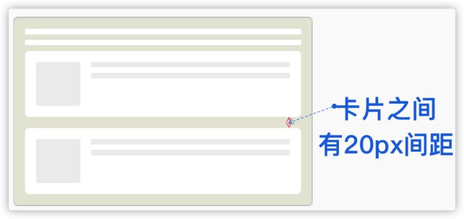
在没有 :not() 选择器的时候,你可能会想到下面这样的方式
1
2
3
4
5
6
7
8
9
10
11
12
| .card + .card {
margin-top: 20px;
}
.card {
margin-bottom: 20px;
}
.card:last-child {
margin-bottom: 0;
}
|
如果换成 :not() 选择器,可以这要来实现:
1
2
3
| .card:not(:last-child) {
margin-bottom: 20px
}
|
虽然 CSS 选择器已经非常强大了,但一直以来,在 CSS 中没有从子元素选到父元素的样的选择器(父选择器):
即将到来的 :has() 选择器它可以用来选择父级元素
1
2
3
4
5
6
| <section>
<h1>H1 Level Title</h1>
</section>
<section>
<h2>H2 Level Title</h2>
</section>
|
1
2
3
4
5
6
| section:has(h1) {
border-color: blue;
}
section:has(h2) {
border-color: red;
}
|
🌰:可能根据子元素的变化,改变父元素的样式,而不必再给父元素添加额外的 class
3. :empty 和 :blank
🌰:有时候数据为空时,如下图这样:
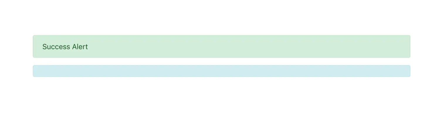
此时我们还要额外隐藏容器,要是有了表示空状态的伪类选择器就可以直接这么写
1
2
3
| section:empty {
display: none;
}
|
但是 :empty 只能选中没有子元素的元素。子元素只可以是元素节点或文本(包括空格)。注释或处理指令都不会产生影响。
1
2
3
4
5
6
7
8
9
10
11
12
13
14
15
|
<div class="error"></div>
<div class="error"></div>
<div class="error pseudo-elements(伪元素)"></div>
<div class="error"> </div>
<div class="error">
</div>
<div class="error">
</div>
<div class="error"><span></span></div>
|
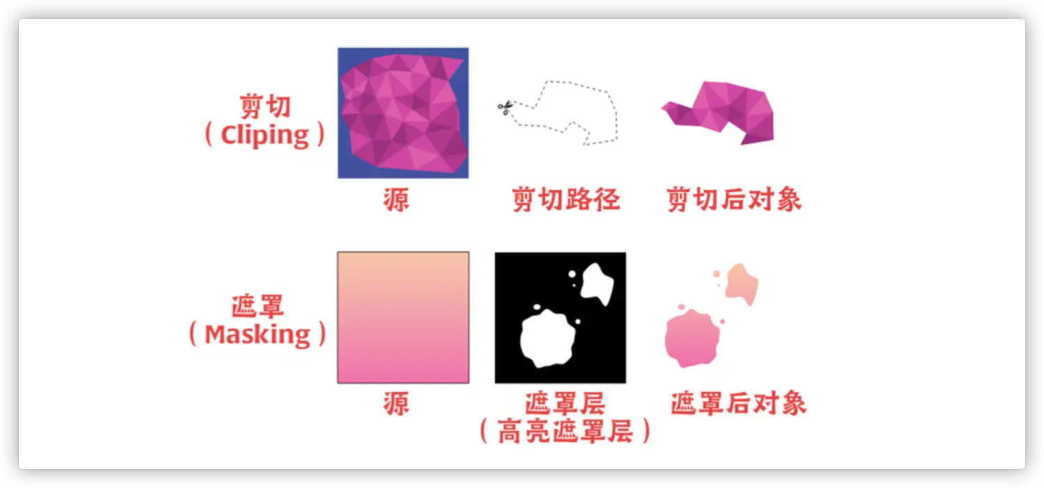
4. mask 和 clip-path
5. mix-blend-mode
1
2
3
4
5
6
7
8
9
10
11
12
13
14
15
16
17
18
19
20
21
22
23
| .wrapper {
position: relative;
}
:is(.wrapper) svg, img {
position: absolute;
top: 0;
left: 0;
}
.wrapper svg {
fill: red;
mix-blend-mode: multiply;
z-index: 2;
}
<section class="wrapper">
<svg id="js-couch" class="couch__overlay" xmlns="http://www.w3.org/2000/svg" xmlns:xlink="http://www.w3.org/1999/xlink" preserveAspectRatio="none" width="1000" height="394">
<defs>
<path d="M996.35 77.55q-1.85-1.95-8.65-3.75l-62.4-17.1q-9.3-2.75-12.15-2.5-1.8.15-2.85.45l-.75.3q2.25-16.3 3.75-22.05 1.15-4.4 1.4-10.8.2-6.6-.7-10.85-1.25-5.65-3.1-7.8-2.95-3.35-9.65-2.7-5.95.6-39.3 1.7-38.3 1.25-39.45 1.3-10.25.5-126.75.5-5.05 0-54.2 1.3-45.8 1.25-54.05.95-19.45-.45-30.4-.7-20.2-.55-23.1-1.3-22.3-5.85-26.5 1.25-2.65 4.55-3.85 7.9-.6 1.7-.7 2.5-.65-2.2-2.05-4.55-2.75-4.65-6.45-5.2-3.85-.55-13.65-.4-7.4.1-12 .4-.4.05-18.7.9-16.55.8-19.15 1.1-3.4.4-14.6 1.1-11.3.75-13.05.65h-9.8q-8.65-.05-11.45-.4-2.85-.35-9.25-.6-6.7-.15-8.5-.25-2.7-.1-27.75-.1-25.1 0-29.6.1-92.35 1.15-99 1.65-5.15.4-20 0-15.3-.4-24.4-1.25-6.75-.6-21-1.55-12.95-.9-14.85-1.1-6.45-1.05-11.05-1.5-8.7-.85-12.85.5-5.45 1.75-8.1 4.65-3.2 3.4-2.9 8.6.25 4.65 2.1 11.8 1 3.8 2.55 9.1 1 3.85 2.35 10.1-.1 1-1.5 1-1.75 0-7.7.85-7.1 1-9.8 2.05-2.4.9-23 4.75-21.2 3.9-22.05 4.15-8.2 1.85-15.05 3.35Q7.4 69.1 5.65 70.3 2.5 72.45 2 73.1.6 75 .75 79.2q.15 4.15 1.3 12.75.9 6.85 1.45 10 .5 2.75 8.55 54 6.65 42.15 7.35 46.85 1.15 7.65 4.9 28.55 4.55 25.2 6.35 31.2 2.45 8.15 3.8 11.75 1.85 4.9 3.2 5.75 1.25.8 6.85.65 2.75-.05 5.3-.25l23.85.35q.1 0 1 .95t2 .95q1.9 0 3.4-1.4l23.1-.25 43.65.4q135.05 2.15 137.9 1.9 1.25-.1 72.9.5 72.45.65 76.85.45 8.1-.35 64 .4 143.35.95 146 1.1.55.05 75.3.3 74.7.3 79.8.6 8.65.5 68.25-.35l51.75.5 1.6.4q1.95.35 3.8.05 1.45-.25 3.5-.2 1.9 0 3.35-.3 2.1-.45 8.25-.8 6.25-.3 8.75-.05 1.7.2 8 1 5.75.3 7.4-1.75 1.75-2.2 4.95-10.85 2.8-7.55 4.05-12.4.65-2.5 3.6-17.2 2.75-13.75 3.15-14.8.45-1.25 4.45-22.85 4.05-22.4 4.4-24.4.3-1.45 3.75-25.2 3.35-23.2 4-26.3 1.15-5.5 2.35-18.8 1.4-15.7.8-23.7-.6-8.35-3.35-11.15z" id="a" />
</defs>
<use xlink:href="#a"/>
</svg>
<img src="https://p3-juejin.byteimg.com/tos-cn-i-k3u1fbpfcp/f6df13a9d4a44573a45e9fc5cbcf012d~tplv-k3u1fbpfcp-zoom-1.image" alt="">
</section>
|
在线:https://codepen.io/kylewetton/pen/OJLmJoV
6. CSS 等比缩放 aspect-ratio
1
2
3
4
| .container {
width: 100%;
aspect-ratio: 1 / 1;
}
|
🌰:
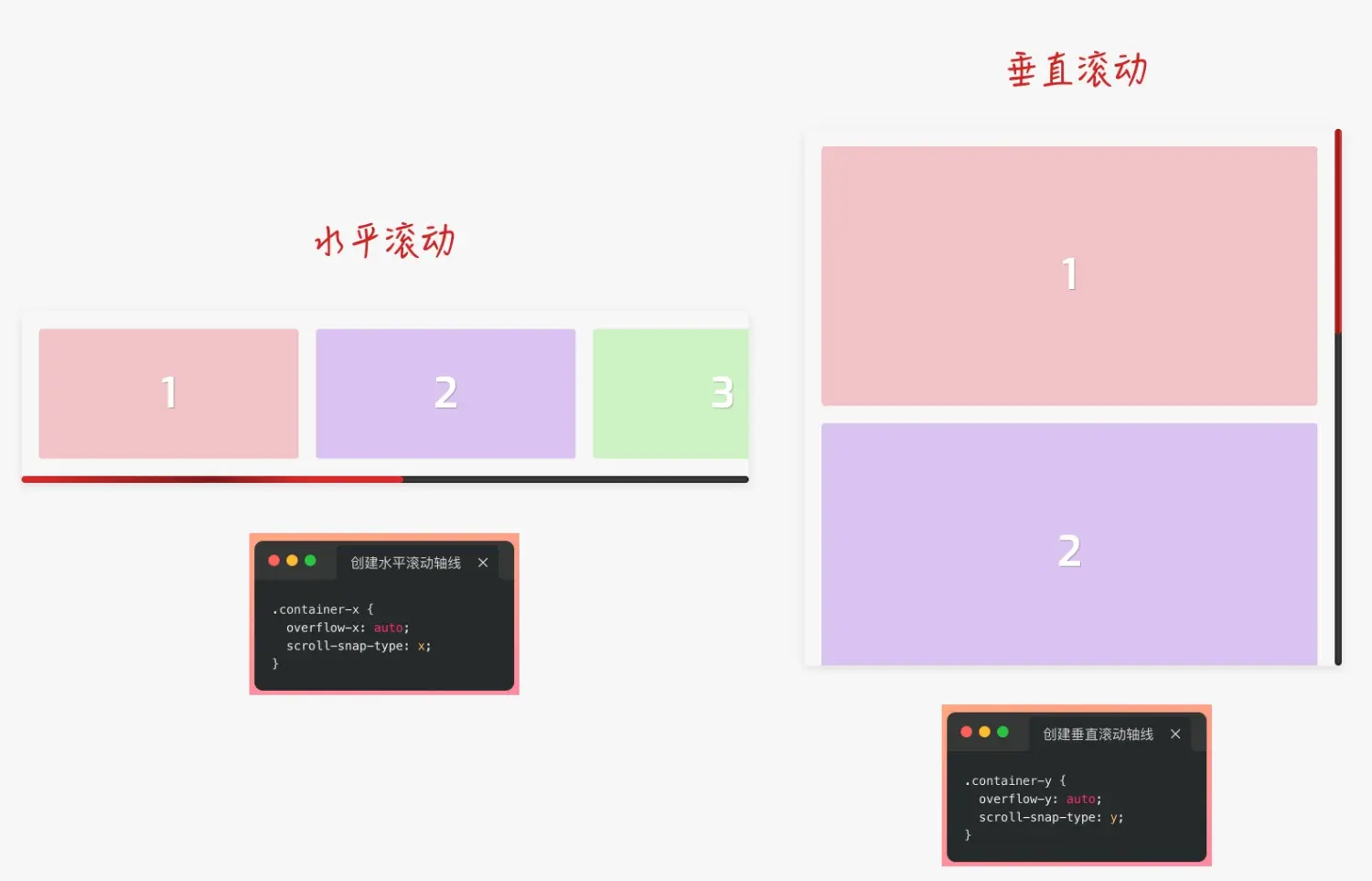
🌰:实现 h5 滚动效果
1
2
3
4
5
6
7
8
9
10
11
12
13
14
15
16
17
18
19
20
21
22
23
24
25
26
27
28
29
30
31
32
33
34
35
36
37
38
39
40
41
42
43
| <!DOCTYPE html>
<html lang="en">
<head>
<meta charset="UTF-8">
<meta http-equiv="X-UA-Compatible" content="IE=edge">
<meta name="viewport" content="width=device-width, initial-scale=1.0">
<title>Document</title>
<style>
* {margin: 0;padding:0;}
.container {
height: 100vh;
overflow-y: auto;
scroll-behavior: smooth;
-webkit-overflow-scrolling: touch;
scroll-snap-type: y mandatory;
scroll-snap-stop: always;
}
.container img {
height: 100vh;
width: 100%;
scroll-snap-align: center;
vertical-align: middle;
}
</style>
</head>
<body>
<div class="container">
<img src="https://picsum.photos/500/300?random=1" alt="">
<img src="https://picsum.photos/500/300?random=2" alt="">
<img src="https://picsum.photos/500/300?random=3" alt="">
<img src="https://picsum.photos/500/300?random=4" alt="">
<img src="https://picsum.photos/500/300?random=5" alt="">
<img src="https://picsum.photos/500/300?random=6" alt="">
<img src="https://picsum.photos/500/300?random=7" alt="">
</div>
</body>
</html>
|
在电脑上的滚动略有卡顿,手机上体验良好
🌰:Demo: codepen.io/airen/full/…(图片的中心位置和容器中心位置对齐)
🌰:Demo: codepen.io/airen/full/… ( iOS的一些原生交互)
🌰:Demo: codepen.io/airen/full/…
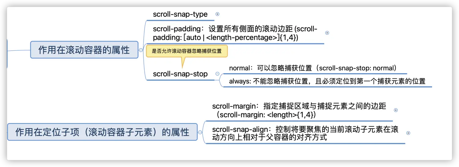
8. CSS Gap(沟槽)
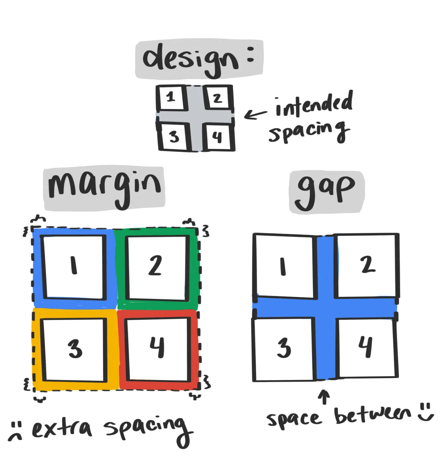
1
2
3
4
5
6
7
8
| .gap {
gap: 10px;
}
.gap {
row-gap: 10px;
column-gap: 10px
}
|
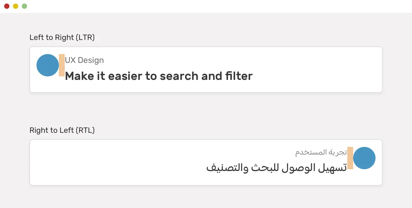
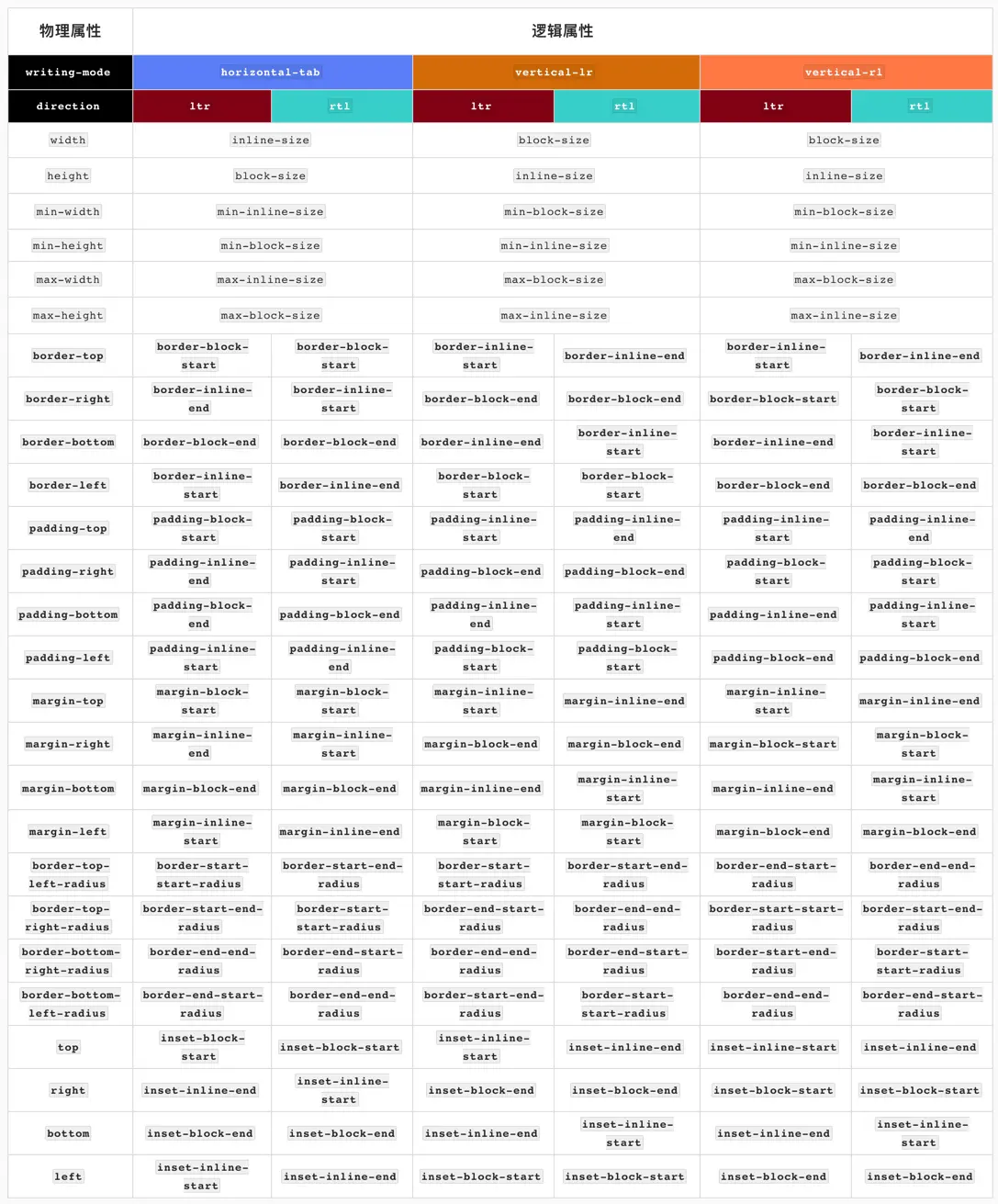
9. CSS 逻辑属性 (个人暂无用处)
可能在某些国际化需求上会用到
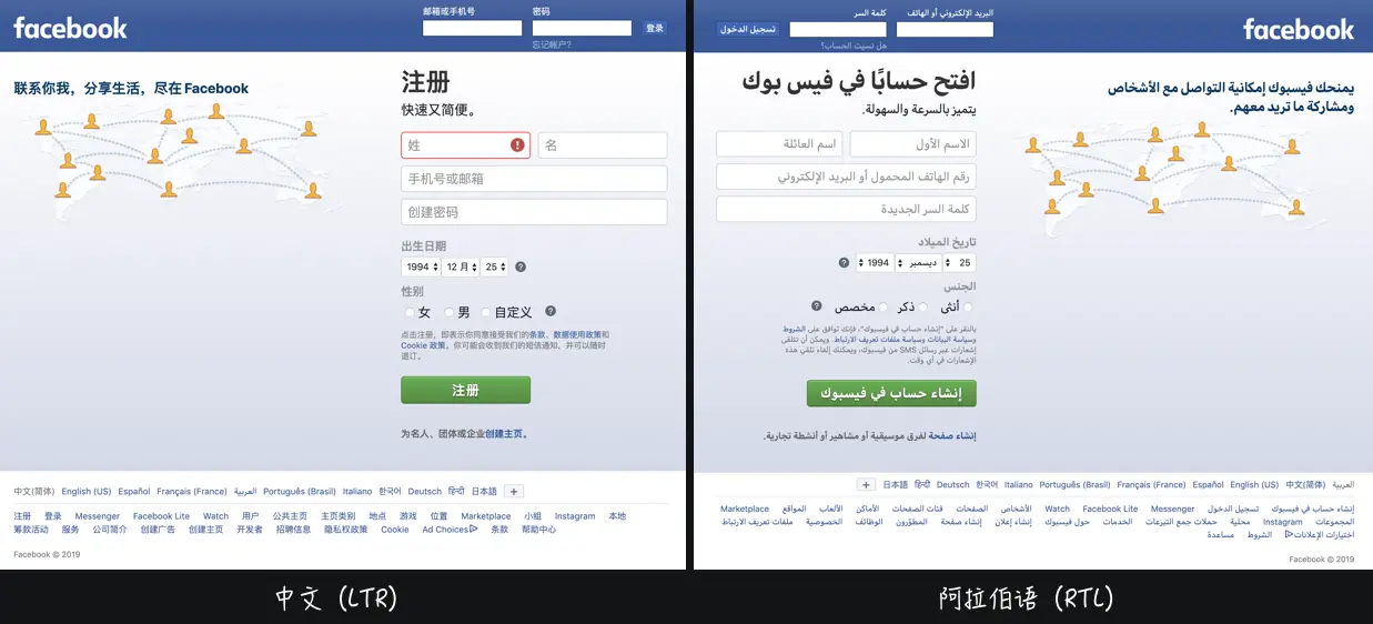
1
2
3
4
5
6
7
8
9
10
11
12
13
14
15
16
17
18
19
20
21
22
23
24
25
26
27
28
29
30
| <style>
.right {
direction: rtl;
unicode-bidi: embed;
}
:is(.right, .left) p {display: inline-block;}
:is(.right, .left) .avatar {
margin-inline-end: 1rem; // 逻辑属性
}
</style>
<div>
<div class="left">
<p class="avatar">头像</p>
<p>内容: abcdefg</p>
</div>
<div class="right" dir="rtl">
<p class="avatar">头像</p>
<p>内容: abcdefg</p>
</div>
</div>
|
10. CSS 比较函数 min() 和 max() 和 clamp()
🌰:min(50vw, 500px) 在浏览器视窗宽度改变时,返回的值的变化:
clamp(MIN, VAL, MAX),这三个值之间的关系(或者说取值的方式):
- 如果 VAL 在 MIN 和 MAX 之间,则使用 VAL 作为函数的返回值
- 如果 VAL 大于 MAX ,则使用 MAX 作为函数的返回值
- 如果 VAL 小于 MIN ,则使用 MIN 作为函数的返回值
1
2
3
4
5
6
7
8
9
10
11
12
13
14
15
| .element {
width: clamp(100px, 50vw, 500px);
width: clamp(100px, 380px, 500px);
width: max(100px, min(380px, 500px));
width: max(100px, 380px);
width: 380px;
}
|
11. CSS 内容可见性 content-visibility 未实测
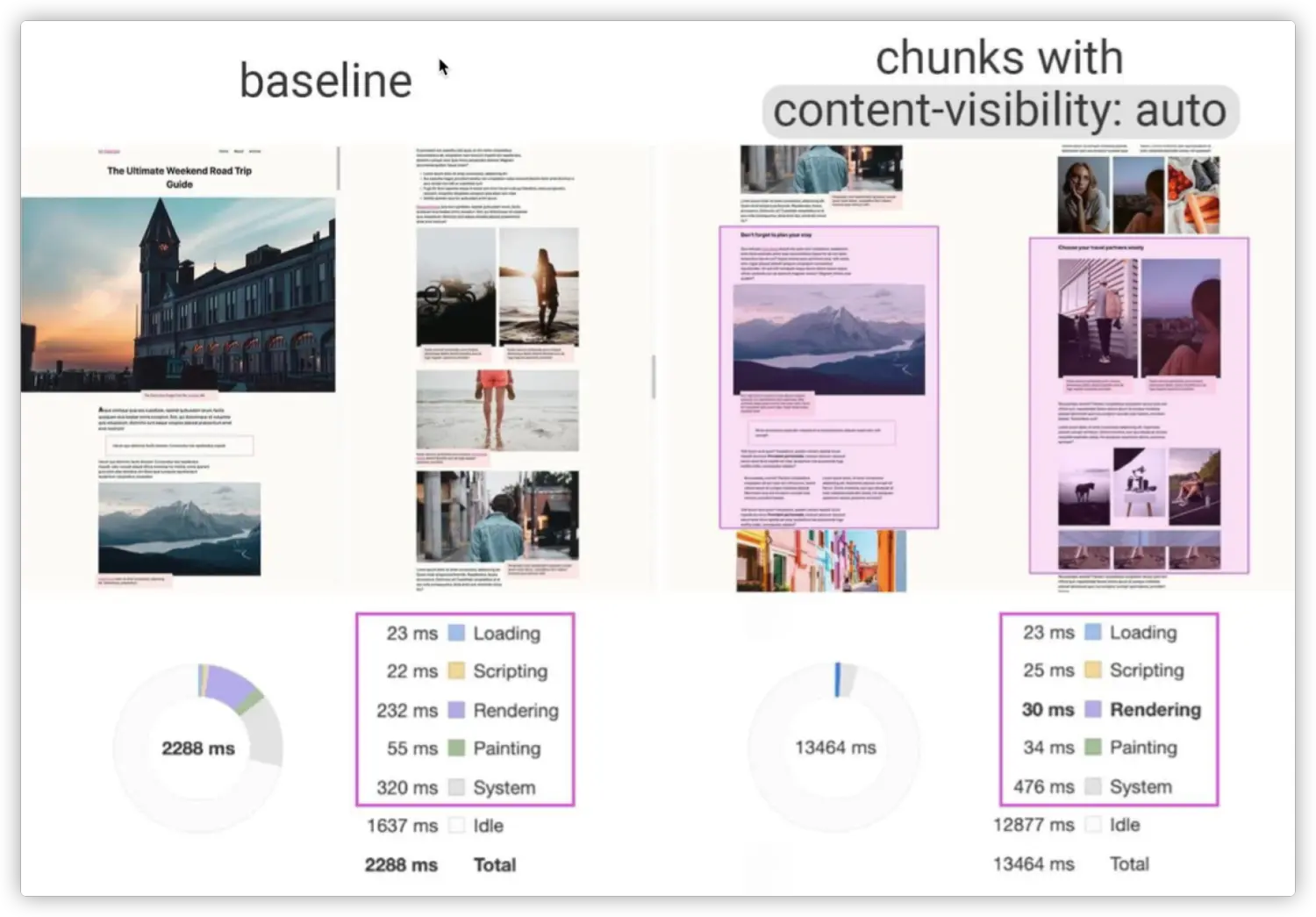
在这种场合下,我们可以使用CSS的 content-visibility 来跳过屏幕外的内容渲染。也就是说,如果你有大量的离屏内容(Off-screen Content),这将会大幅减少页面渲染时间。
1
2
3
4
| section {
content-visibility: auto;
contain-intrinsic-size: 1000px;
}
|
12. CSS 的嵌套 未发布
W3C 也在讨论和定义CSS中的嵌套规则。目前两种规则:
1
2
3
4
5
6
7
8
9
10
11
12
13
14
15
16
17
18
19
20
21
22
23
24
25
| foo {
color: red;
@nest bar {
color: green;
}
}
foo {
color: red;
& bar {
color: green;
}
}
foo {
color: red;
}
foo bar {
color: green;
}
|
1
2
3
4
5
6
|
@scope (.tabs) to (.panel) {
:scope { }
.light-theme :scope .tab { }
}
|